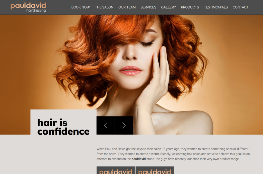
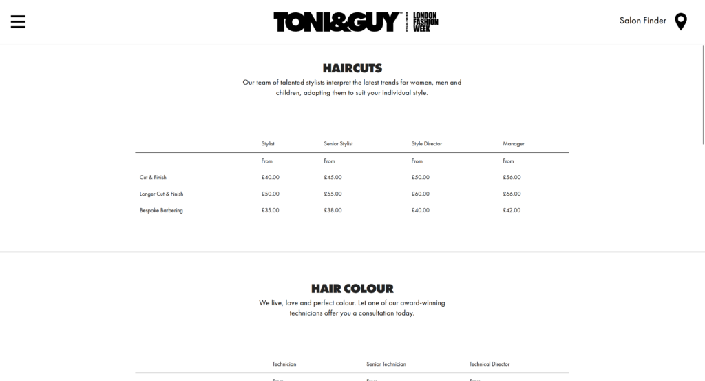
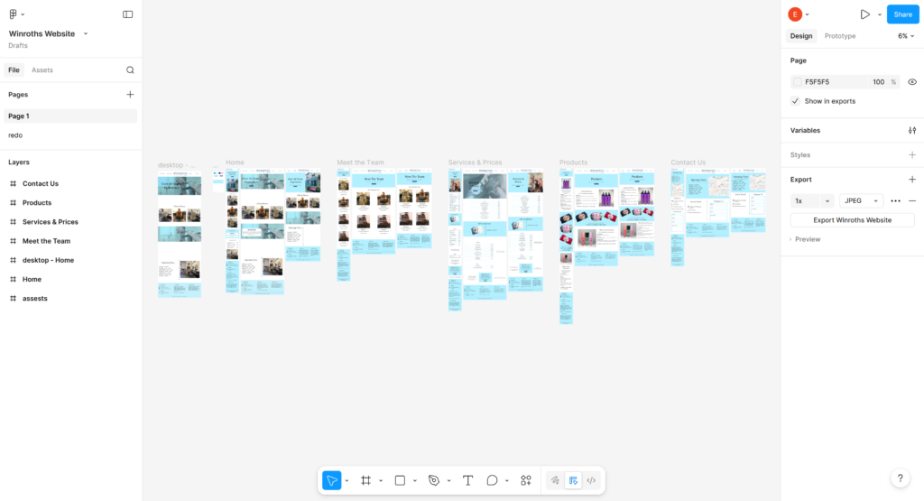
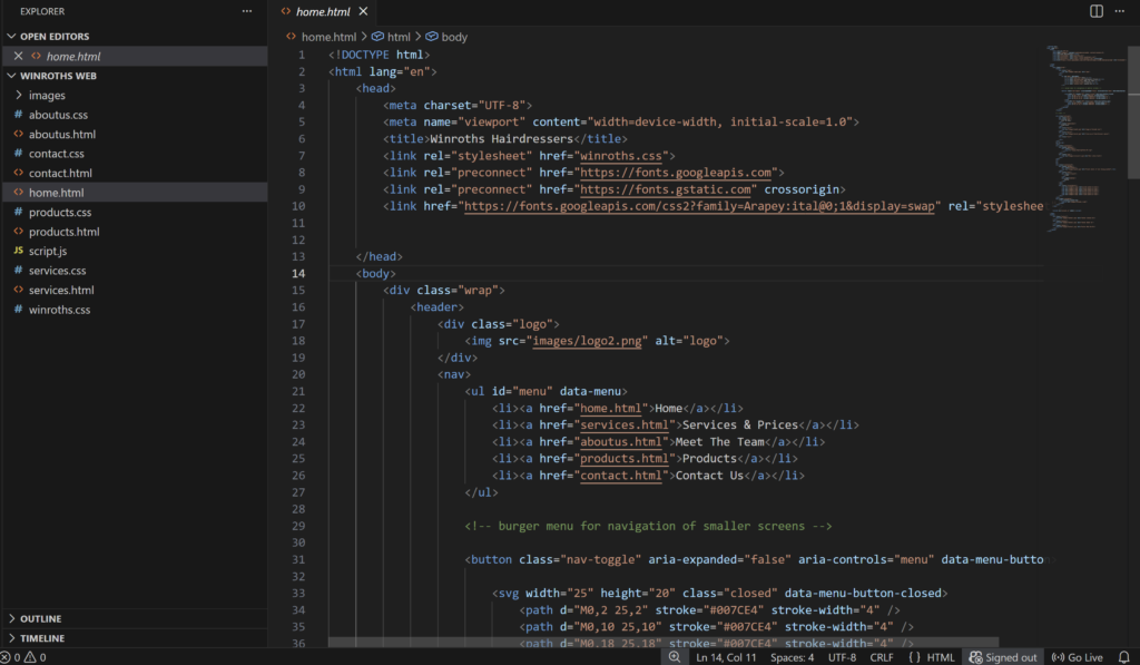
Winroths Hairdressers

2024

UX/UI Design
Web Design

The Brief

This third-year university project focused on developing a dynamic WordPress website promoting activities and attractions in Leeds, with priority given to user experience rather than purely visual design. The brief involved creating a hand-coded static prototype before progressing to a fully functional WordPress site, encouraging consideration of UX flow, information architecture, and user-centred functionality. The project explored how structured content, responsive design, and integrated features can support efficient user journeys and enhance overall usability.

Software used:

My Creative Process

The following sections outline the research, planning, and development process:

1. Understanding My Client

The client required a website that clearly presented their services, pricing, and team information. The design needed to align with their existing branding, incorporating a sky-blue colour palette and serif typography. At the same time, the client wanted the layout and styling to feel modern and approachable, ensuring the website did not appear outdated and would appeal to a younger audience. My clients target audience was primarily older ladies, who my client advised may not be up to date with technology therefore the website needed to be easy to navigate and efficient in quickly showing the customer what they need e.g. prices, services, contact details etc. While also aiming to attract a newer younger target audience by using certain layouts and design choices.

2. Further Research

After speaking with my client I than research other established hairdressers in the surrounding area, focusing on:

Their design

UX flow

Content featured

3. Wire framing

I began the project with initial sketches to explore layout ideas, before moving on to basic wireframes and then creating a high-fidelity prototype. I received feedback from the client at each stage of the process, which helped shape the design as it developed. For example, the client asked for a Google Map to be included so customers could easily find their location. Throughout the project, I focused on balancing the client’s feedback with user experience considerations, ensuring the website was simple to navigate. This was especially important as the client mentioned that a large portion of their customers are older, so the layout needed to remain clear and easy to use.

4. Static Website

Due to the limitations of the university module, the website remained static and did not include a database to support dynamic functionality. Despite this, I experimented with different CSS layout techniques to achieve the simple, modern design requested by the client. I used a combination of absolute positioning and Flexbox to structure the main layout, while grids and tables were implemented to organise key content such as services, pricing, and the client gallery.

Scroll to Top