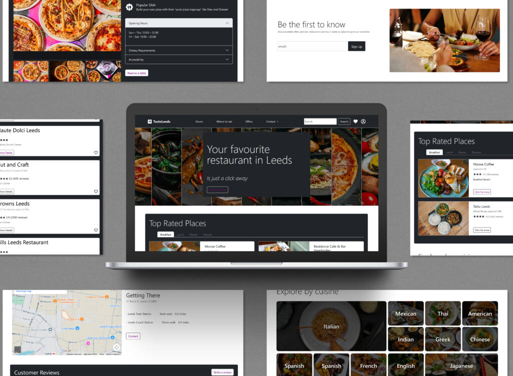
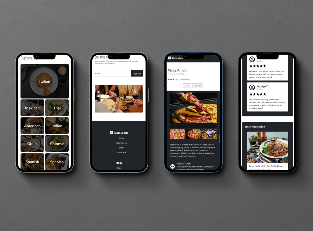
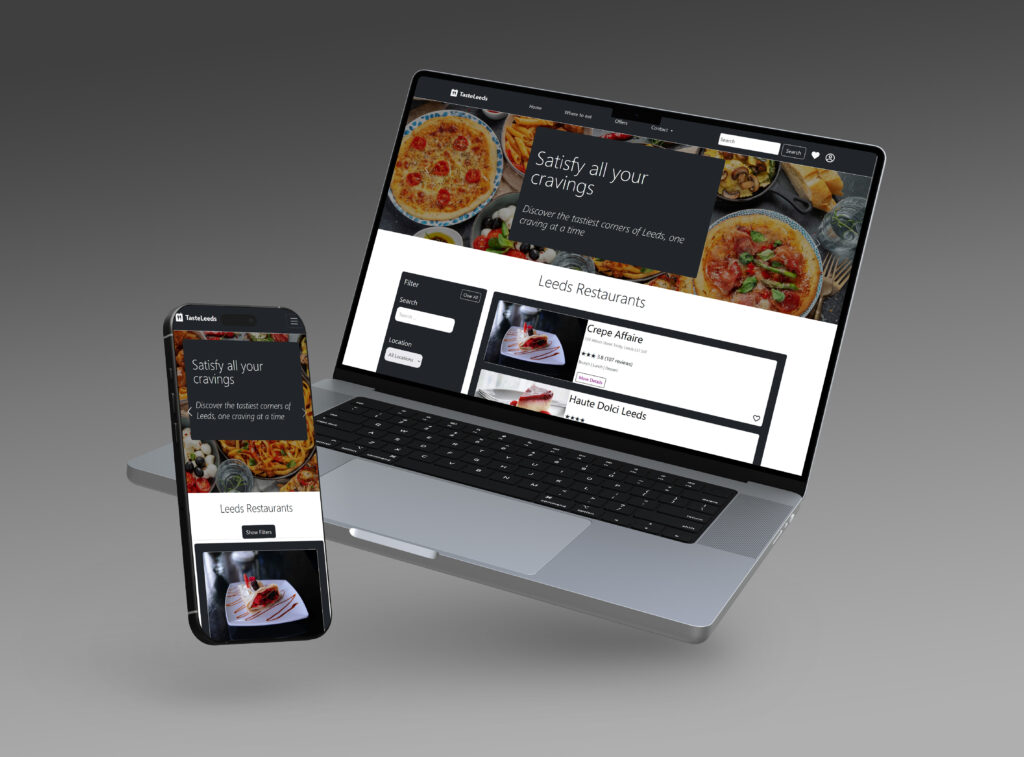
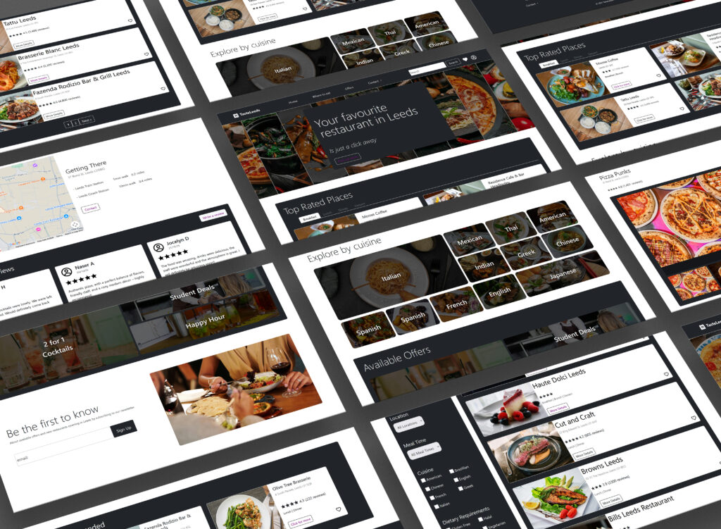
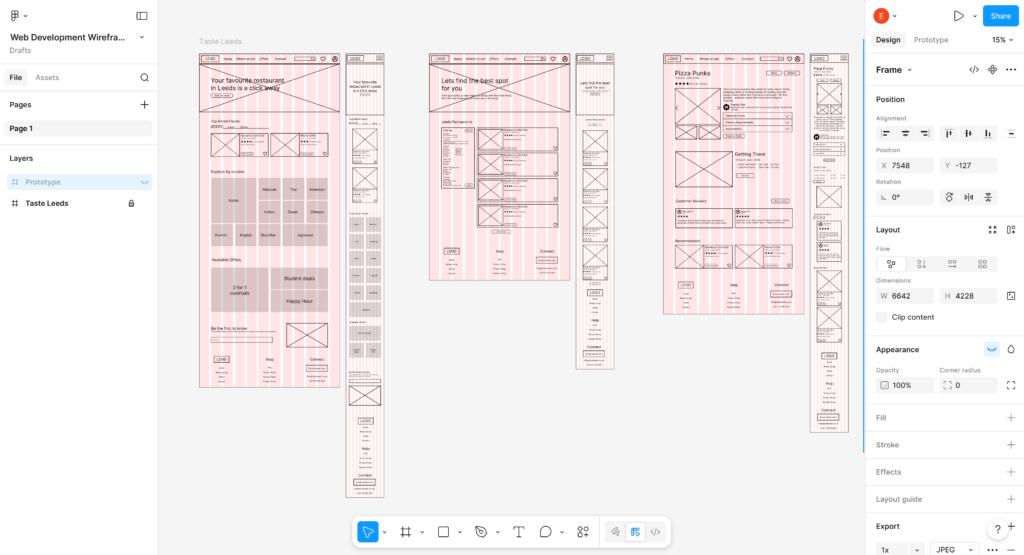
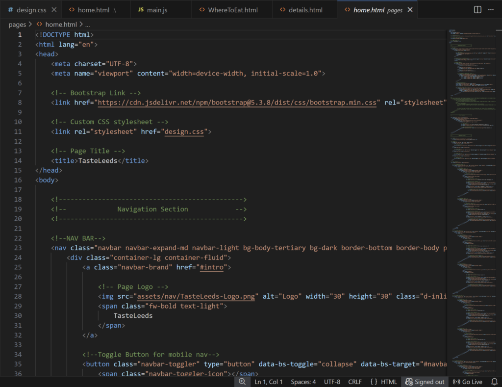
Taste Leeds
2026
The Brief
This third-year university project focused on developing a dynamic WordPress website promoting activities and attractions in Leeds, with priority given to user experience rather than purely visual design. The brief involved creating a hand-coded static prototype before progressing to a fully functional WordPress site, encouraging consideration of UX flow, information architecture, and user-centred functionality. The project explored how structured content, responsive design, and integrated features can support efficient user journeys and enhance overall usability.
Software used:
My Creative Process
The following sections outline the research, planning, and development process:
1. Understanding My Client
This brief didn’t allow for a real world client, due to the focus of this university module not relying on the design of the final website but centered around back-end development on wordpress and MAMP. Furthermore, there was no design research or development in the design due to it not being in the marking scheme. Therefore, all design choices e.g. colour scheme, typography and images were chosen by me. I decided to create a hypothetical client, who aimed to promote local businesses to university students. Therefore my target audience would be primarily young adults/students.
2. Finalising ideas
Reflecting the brief I ensured all design aspects were centered around the user experience and the UX flow of the website. I wanted to ensure the website was structured to enhance usability by making everything interlink and have a purpose. I decided to create “TasteLeeds” to promote different restaurants in Leeds because of the diversity of students coming from across the nation and globe, I thought a website simplifying restaurants into cuisines, meal times and locations would be very helpful. I thought sections such as ‘Student Offers’ would appeal to this audience as well as a clean, modern aesthetic with a sans serif typography.
3. Further Research
In finalizing the type of website I wanted to create I analysed other established food and hospitality platforms, focusing on:
Their responsive layout
UX flow
Accessibility & Validity
4. Wire framing
Beginning with sketches and transitioning to wireframes. My main focus was my UX flow, to make naviagting from the index to the listing to the details page seamless. I created my wireframes inline with Figma’s layout guide to ensure it would be responsive and suitable for bootstrap.
I critiqued the wireframes based on the feedback I received from my lecturer and fellow students, when I prompted them to prototype the website. I ensured all elements would appeal to my target audience and allowed for a simple and effective user experience flow from start to finish.
5. Static Prototype
Development began with coding a static website implementing responsive design principles using Bootstrap’s grid system to ensure usability across devices. Accessibility considerations were applied through semantic HTML structure, clear navigation hierarchy, and appropriate colour contrast to support inclusive user interaction, while minimising errors and warnings during W3C validation.
6. Dynamic Website
The static website was then converted into a custom WordPress theme by separating reusable components such as the header, footer, and content templates, enabling dynamic content management through the WordPress CMS. Advanced Custom Fields (ACF) was integrated to create reusable data fields for restaurant listings, alongside a dynamic search and filtering system to enhance navigation within the listings page.
